Character Design
Character Creation Process for Darkly Glass
I wanted to put up a post about the character creation process for this project for my own records and in case anyone was interested in producing assets in a similar way. I had always assumed the process would be analogue > digital. Sketching on paper with pencil and ink and then importing into Procreate on iPad with an apple pencil. I eventually based all the colour in the final look of the game scenes using shaders in Godot so the artwork was eventually modified for the current demo version. Really that just meant going back and removing some of the colourised layers in procreate. I'll make additional post for background art development and shaders in Godot.
I take a couple of sketchbooks for drawing, one is a Rhodia dotbook, which because of the dots on the page is great for planning out form and mapping perspective, I'll then do more final sketches in a plain paper bristol sketchbook. For Darkly Glass I wanted to bring in some of the style of Yoji Shinkawa, probably one of the most uniquely personal styles of any concept artist working today. Very tough to emulate.
Pen and Paper
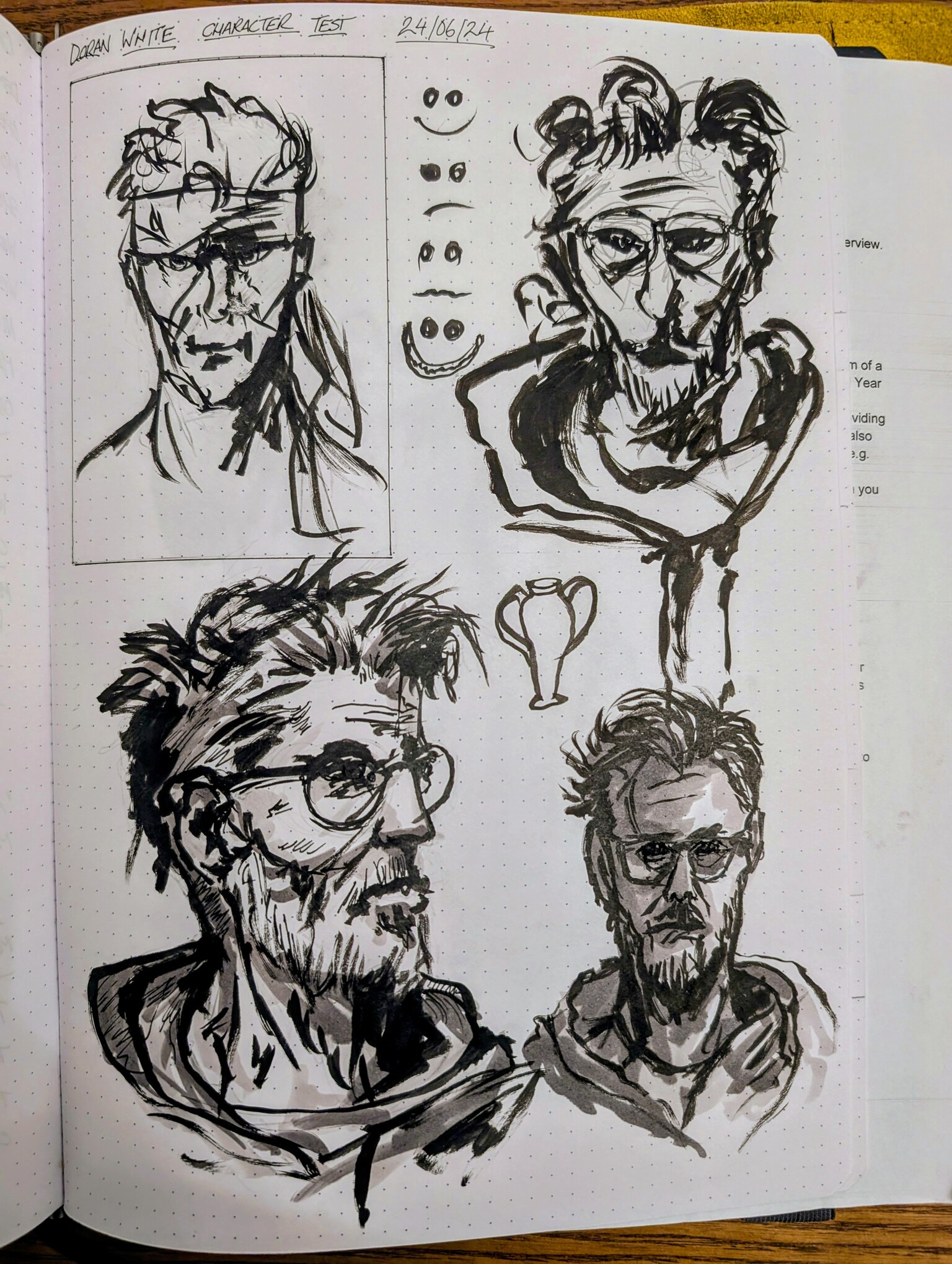
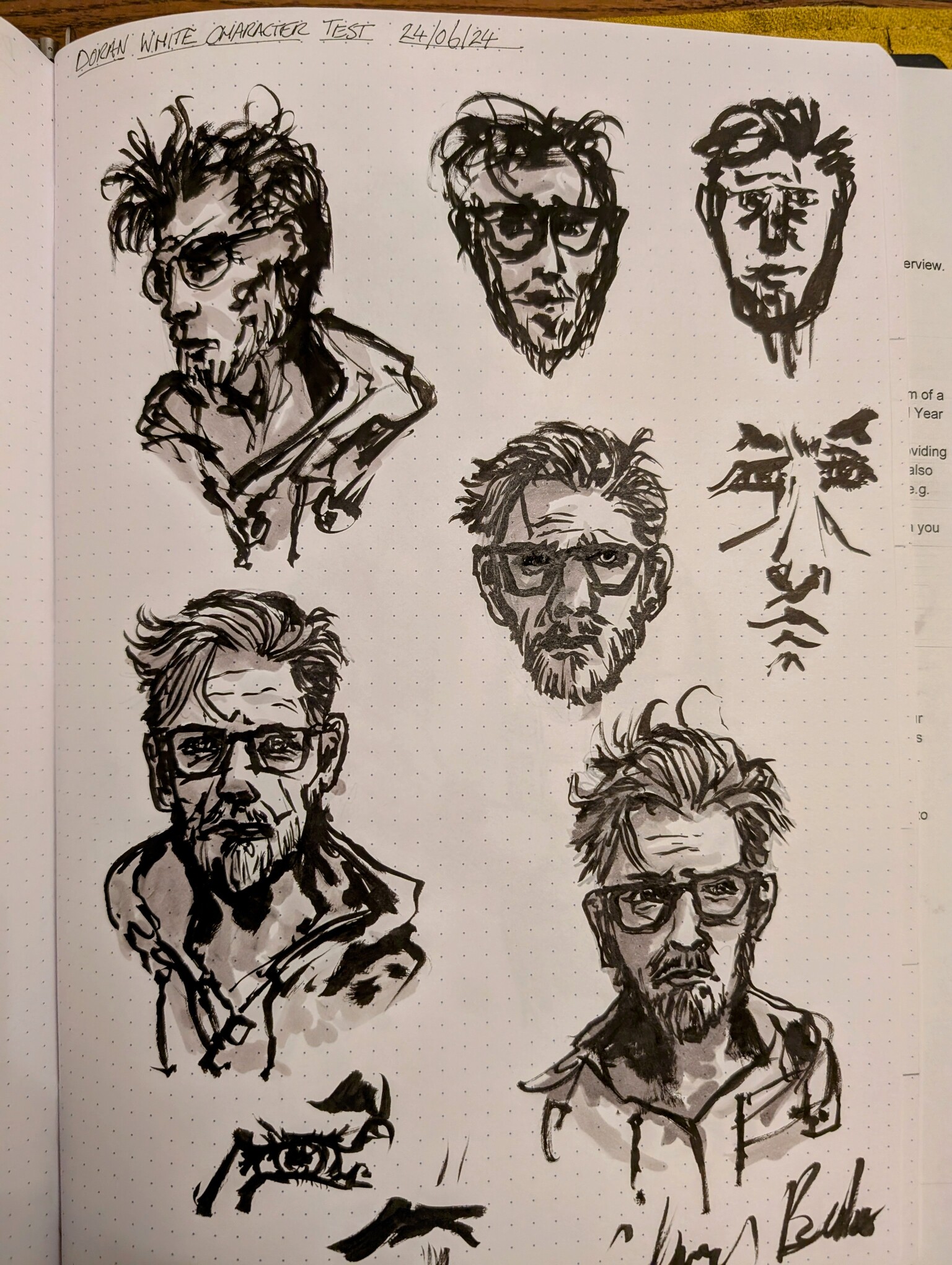
After these loose sketches are in place, I'll focus on elements I like and rework in the other sketch book.
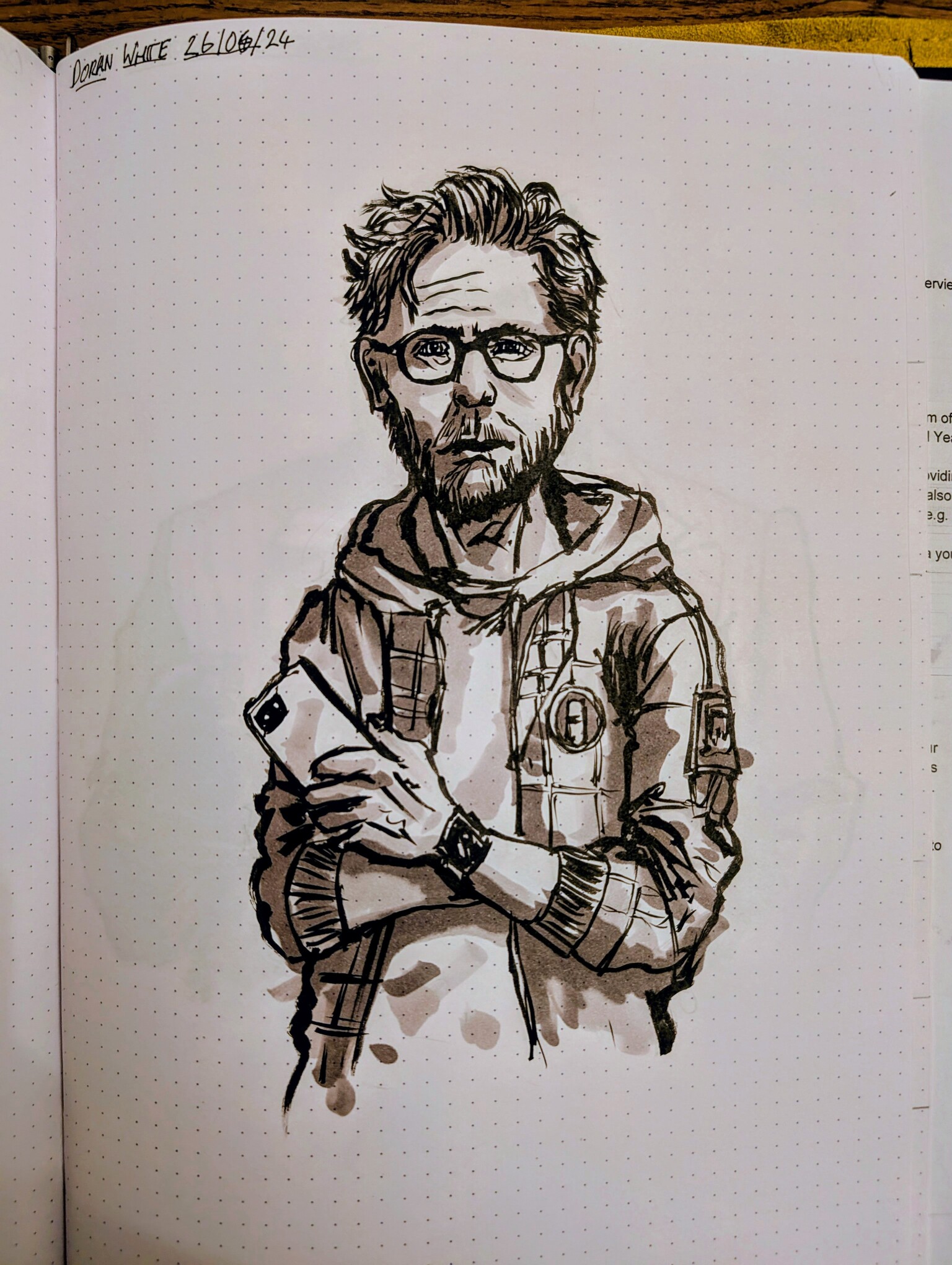
Below image was pretty close to the final design.
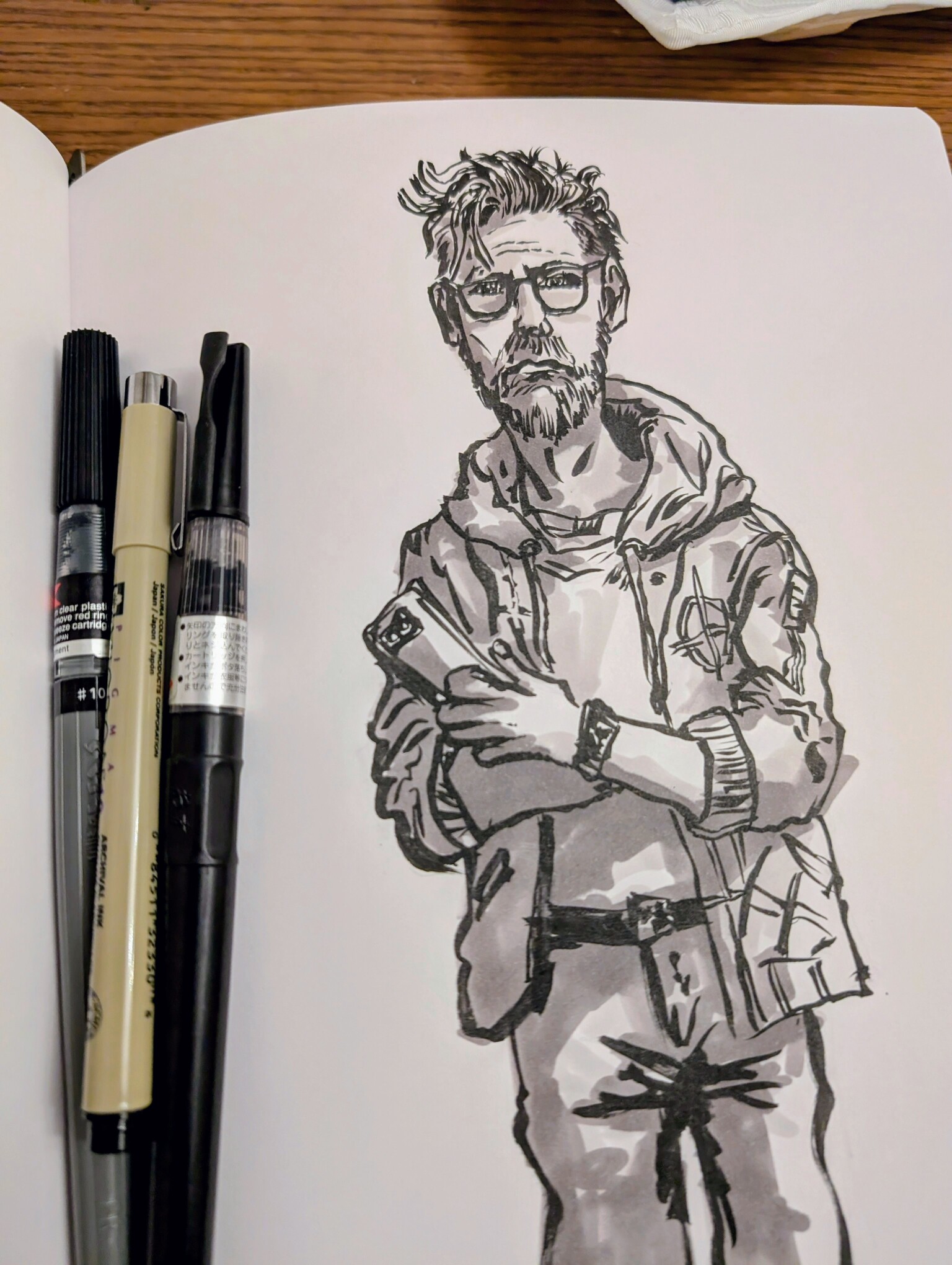
For line work I use a mixture of Pentel Japanese calligraphy pens and Pigma Microns
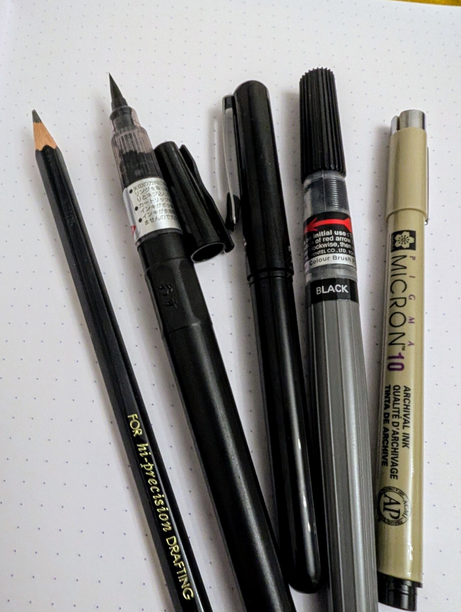
I'll continue on with this process for additional characters.
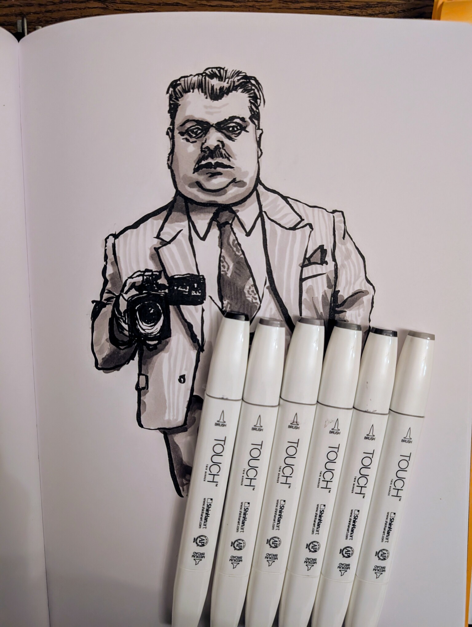
To fill out the line work with some depth I like the Shinhan Art Touch double ended markers in shades of grey. After working up a series of sketches I will photograph them, upload them to a cloud storage account and pull them back down onto the iPad. A process that Apple makes weirdly annoying and clunky, it's been that way for several years. Once they are on though I can work up an image in a 4K suitable resolution and just export it in increments of 50% size as needed.
Digital Resketch on iPad
The original plan was to have all the game artwork as a kind of "out of phase" RGB that looked something like chromatic aberration. It involved having layers of red green and blue opacity block colour over the shading.
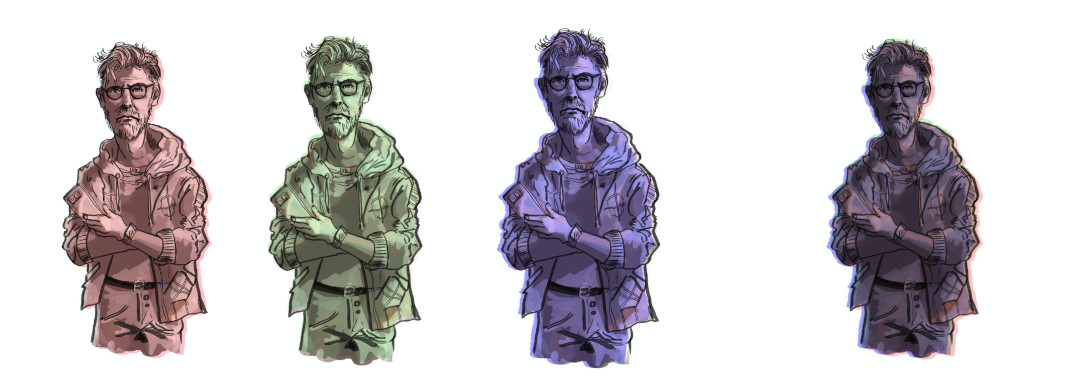
The end result was just ok it would probably look fine generally. Maybe a little worse on an old monitor and possibly quite muddy on smaller screens like Steam Deck, which I eventually want to support. However OK it was going to look it was going to look like that ALL the time. Every scene and every character would have this look applied. I thought about dropping layers scenes which were red or green and knew that would require uploading 4 of every character image. But each character in dialogic 2 can have several different expressions. Exponentially more images to keep track of and I quickly utilised an animated scene for the default pose which added an eye blink to each character.
I quickly started to experiment with shaders. I am currently using a tone colour applied to backgrounds, chromatic RGB and film grain with controls for saturation contrast and brightness. The same for character but also with a tone mapper that switches out the white grey and black in an image for three colours you can add as variables for each scene. I can explain more on the shaders in a separate post but please leave a comment if your interested in knowing more about the art asset processes so far.
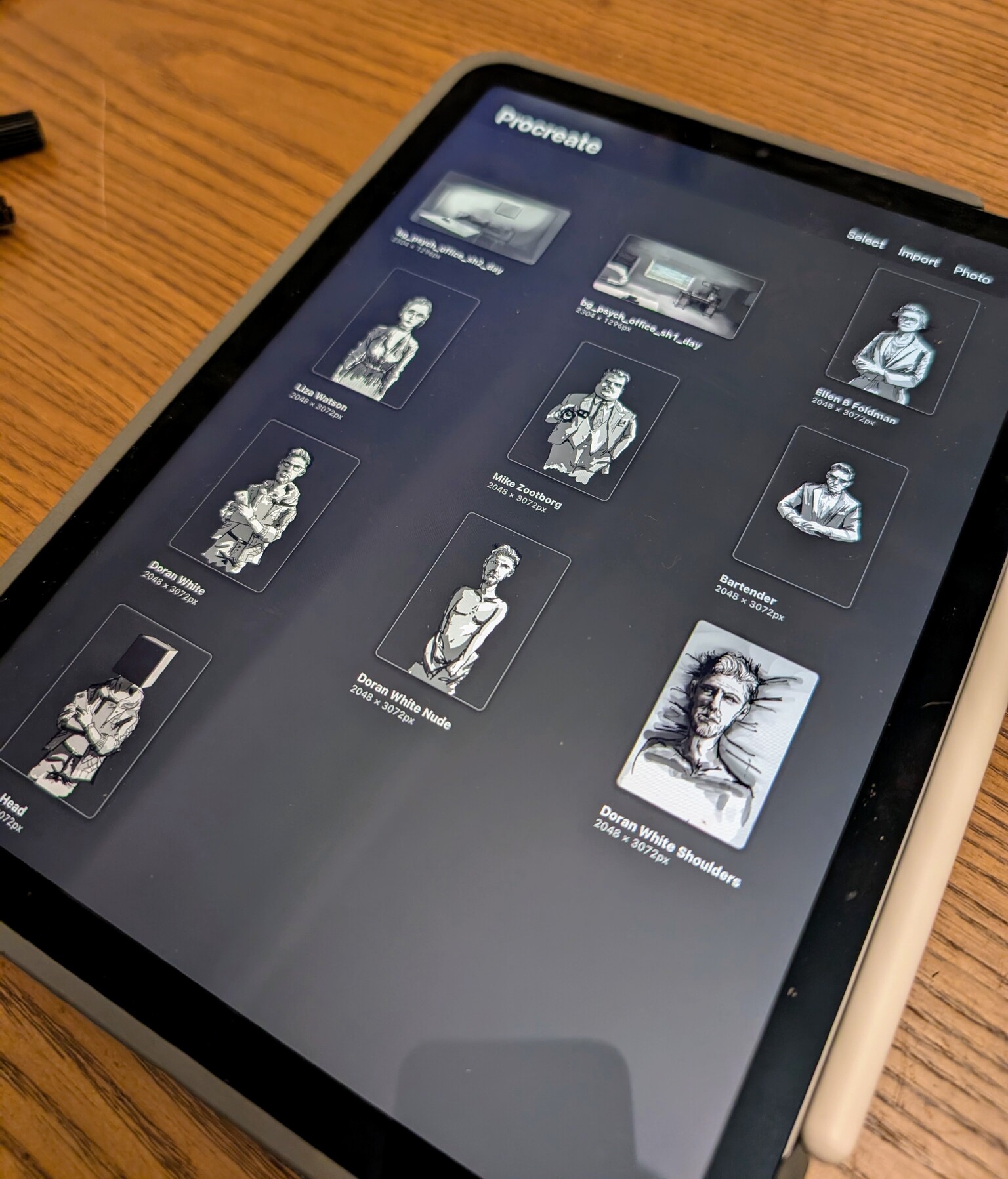
Heres an example of a final asset in procreate now and how they look in a scene with adjust variables.
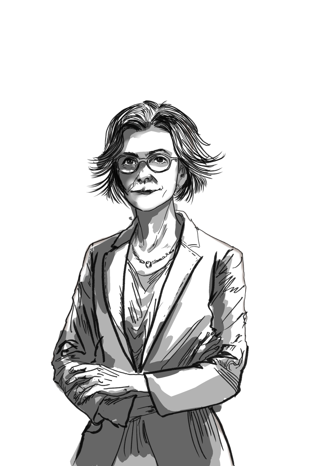
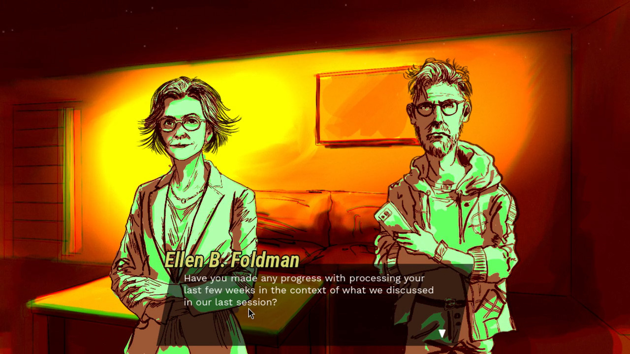
Thanks for reading
Files
Darkly Glass - Demo
Trade your soul for digital fame in this psychological visual novel.
| Status | In development |
| Publisher | |
| Author | BioSignosis |
| Genre | Visual Novel, Adventure, Interactive Fiction |
| Tags | Godot, Hand-drawn, Narrative, Singleplayer, Story Rich |
| Languages | English |
Comments
Log in with itch.io to leave a comment.
Your design progress is really interesting, the sketches are neat but the end result is very good. I saw your forum post and thought the art looked really cool so this was a nice read.